Dashboard charts and widgets
Overview Copied
This section walks you through on how to create, modify, and use different charts from the Widget group in the Active Dashboard Palette.
Configure chart properties Copied
Beginning Active Console 5.5.x, the Managed Entity display name is used in the user readable path. This also reflects in the charts and widgets legends in the Active Dashboard. For dashboards that are configured in the Active Console 5.4.x and below, the user readable path of the charts and widgets legends retain its original value. However, you can manually update the display names. The chart properties are applicable to Line Chart, Bar Chart, and Spark Chart.
To configure the properties of the chart:
- Select the chart you want to use in the Active Dashboard Palette.
- Drag and drop the shape into the Active Dashboard canvass.
- Perform any of the following:
- Right-click the chart and click Properties.
- Select the shape and press
CTRL+Enter. - Modify the properties using the Object Inspector.
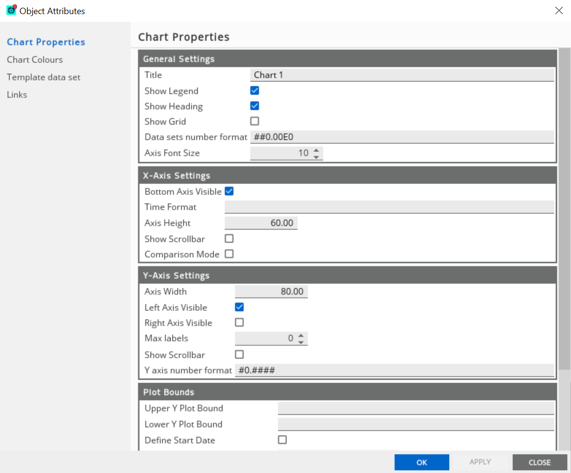
The table shows the list of chart properties depending on the type of widget you have selected:
Charts with the same datasets Copied
In Active Dashboard, you can create multiple charts provided that each chart has its own datasets.
However, if you create multiple charts with the same dataset paths, this may result in the disappearance of duplicated datapoints in the new chart.
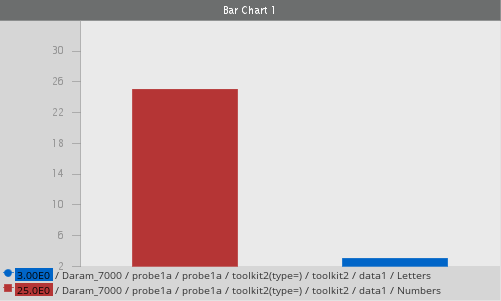
In the example below, the Bar Chart 1 has the following dataset paths:
- Dataset path 1:
/ gw1 / probe1 / me1 / toolkit(type=) / toolkit / data1 / Numbers - Dataset path 2:
/ gw1 / probe1 / me1 / toolkit(type=) / toolkit / data1 / Letters
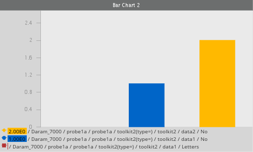
In the example below, the Bar Chart 2 has the following dataset paths:
- Dataset path 1:
/ gw1 / probe1 / me1 / toolkit(type=) / toolkit / data1 / Letters - Dataset path 2:
/ gw1 / probe1 / me1 / toolkit(type=) / toolkit / data1 / No - Dataset path 3:
/ gw1 / probe1 / me1/ toolkit(type=) / toolkit / data2 / No
Both Bar Chart 1 and Bar Chart 2 have the same / gw1 / probe1 / me1 / toolkit1(type=) / toolkit / data1/ Letters dataset path. Since this path has been plotted on Bar Chart 1, it will no longer appear on Bar Chart 2.
| Chart properties | Description |
|---|---|
| Title |
Name of the chart. Default value: Chart 1, Chart 2 |
| Show Legend |
Shows or hides the legend name in the chart. Default: Enabled |
| Show Heading |
Displays the heading of the chart. Default: Enabled |
| Show Grid |
Displays the horizontal lines in the chart. Default: Disabled |
| Data sets number format |
Sets the data sets number format in the chart. Default value: |
| Axis Font Size |
Sets the text font size to the X and Y axis labels in the chart. Default: 10 |
| X-axis Bottom Axis Visible |
Displays the value of each data set and time in the X-axis. Default: Enabled |
| X-axis Time Format | Sets the time format in the X-axis. |
| X-axis Axis Height | Changes the height of the X-axis or the horizontal line. |
| X-axis Show Scrollbar |
Shows or hides the scrollbar to adjust the time range on top of the X-axis. Default: Enabled |
| X-axis Comparison Mode |
If the chart is in comparison mode, then all datasets that are offset (in time) show with a left or right arrow. Default: Disabled |
| Y-axis Axis Width | Changes the width of Y-axis of the vertical line. Settings this value to 0 completely hides the axis. |
| Y-axis Left Axis Visible |
Displays the value on the left axis of the chart. Default: Enabled |
| Y-axis Right Axis Visible |
Displays the value on the right axis of the chart. Default: Disabled |
| Y-axis Max labels |
Controls the maximum number of labels displayed on the Y-axis. If this field is set to |
| Y-axis Show Scrollbar |
Shows or hides the scrollbar to adjust the time range on top of the Y-axis. Default: Enabled |
| Y-axis number format |
You can control the format of the numbers displayed on the Y-axis. The pattern used to specify the format is defined for the Java DecimalFormat Class. Default value: The meanings of the characters in this string are:
|
|
Upper Y Plot Bound, Lower Y Plot Bound |
If blank, the system automatically calculate the suitable bounds. You can override these fields and enter your desired bounds value. |
|
Define Start Date, Define End Date |
If enabled, the system automatically calculate the suitable start and end dates for the X-axis. You can override these dates to zoom in the data on the X scale. |
| Constantly Tick | If enabled, all the datasets on the chart update every five seconds regardless of whether the items are plotting and updating. |
| Maximum Displayed Time |
Determines the oldest data point that should be displayed on the chart. If this value is set to one hour, then the chart does not display the data points older than one hour period. You can use this property to create a rolling tick chart that only displays the most up to date data. Note: The older data points are not lost. You can always access them by setting the maximum displayed data to a longer period or by defining a set start date for the chart, an action which overrides the maximum displayed time setting. |
| Maximum Time Data is retained |
Determines at what point data should be removed from the chart. For example, a value of one hour in this field means that the dataset removes all data points that occurred more than one hour before the current time. You cannot recover these data points. This is useful if you are no longer interested in old data and you do not want to suffer the memory overhead of retaining an ever growing dataset. By default, this value is set to 24 hours worth of data. |
Line Chart Copied
Line Chart is a type of widget capable of displaying multiple charts. Each chart can plot multiple datasets from different data items. A chart always plots time on the X-axis, and the value of the data points (that make up the datasets) on the Y-axis.
Create a Line Chart Copied
There are several ways that you can create a Line Chart, depending on the existing dashboard objects and data items you want to plot.
To create a new Line Chart:
- Go to View > Active Dashboard > Show Tool Palette

- Double-click Widget.
- Drag and drop the Line Chart into the Active Dashboard canvas.
- Right-click the Line Chart to populate new or historical data.
If you want to create a Line Chart with multiple data items:
- Press
CTRLwhile selecting multiple data items from the Metrics dataview. - While pressing the
CTRLand the selected data items, drag and drop these data items into the Active Dashboard canvas. This opens the Tools & Modifiers dialog. - Select Line Chart in the Tools & Modifiers dialog.
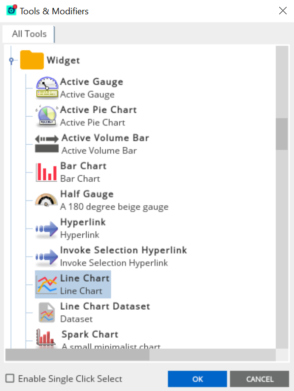
- Click OK.
In this example, three data items are selected from the Metrics dataview.
Add new data to an existing Line Chart Copied
To add new datasets that can be configured on existing charts:
- Right-click the selected data item from the Metrics dataview.
- Click Show Chart. This displays the list of all existing charts in your Active Dashboard.
- Select the name of the chart where you want to add a new data item. This adds the new data item into the existing Line Chart you have selected.
Alternatively, you can:
- Drag and drop the selected or multiple data from the Metrics dataview into the existing Line Chart. This opens the Tools & Modifiers dialog.
- Select Line Chart Dataset on the All Tools tab.
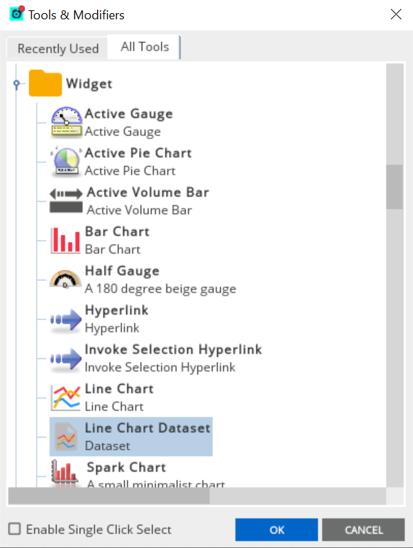
- Click OK. This adds the new data items into the existing Line Chart.
Note
Selecting Line Chart on this dialog creates a new Line Chart.
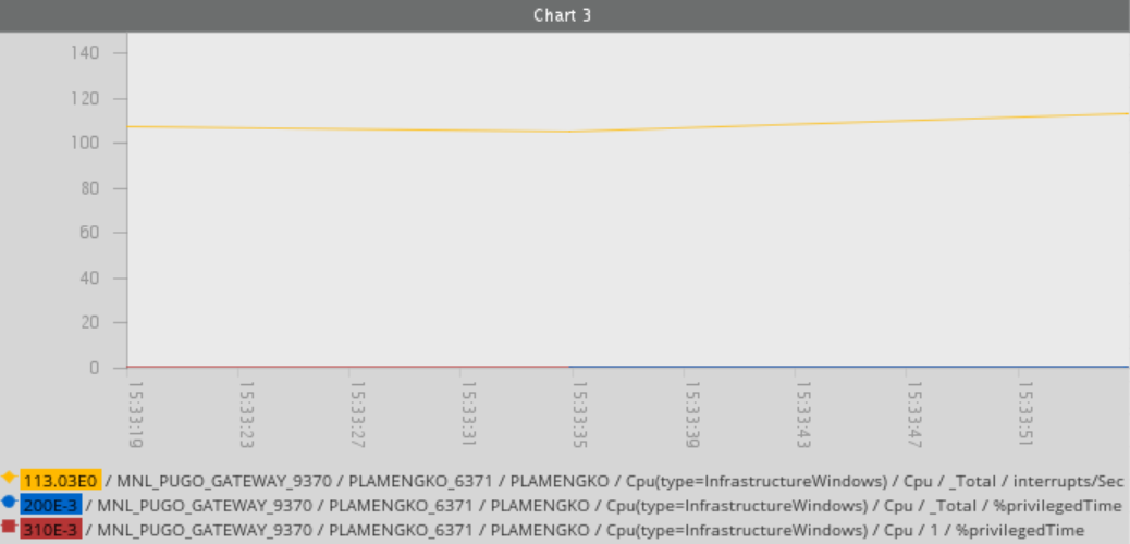
If you want create a Line Chart with one data item:
- Right-click the selected data item from the Metrics dataview.
- Click Show Chart > New Chart. This creates an active chart in the Active Dashboard canvas.
Create a Line Chart using ITRS Analytics data Copied
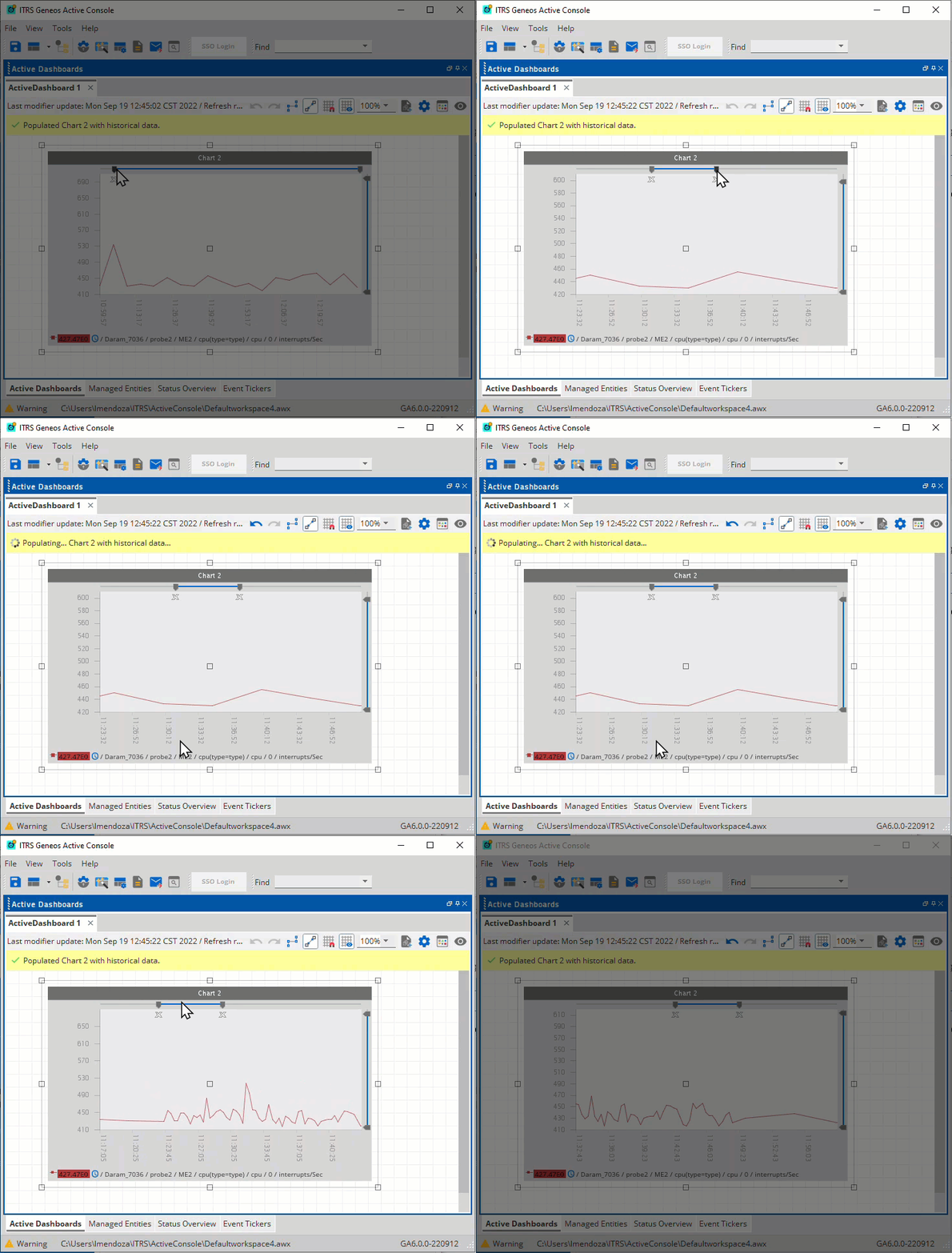
Creating a Line Chart using ITRS Analytics data sets is the same as using other data source. However, ITRS Analytics always use average aggregation, and the initial bucket size is based on the width of the chart in pixels.
When you adjust the width or horizontal scrollbar (X axis) of the chart to select a data range, the Active Console sends the query to ITRS Analytics the ITRS Analytics auto update interval (which defaults to 2 seconds). You can modify this value in the Workspace Settings.
If the data source query is successful, then the number of historical data is adjusted based on the new chart width. By default, ITRS Analytics data sets are not interpolated. For more information, see How interpolation works.
In this example, more data points are plotted in the selected date range.
Add a new ITRS Analytics dataset to an existing Line Chart Copied
If you add a new historical dataset to an existing Line Chart, the horizontal scrollbar takes precedence and the chart will be populated with the series of new datasets corresponding the selected time range.
In this example, the new ITRS Analytics dataset from the Last Hour is added and the selected time range in the existing line chart does not move. This makes the chart and the datasets consistent.
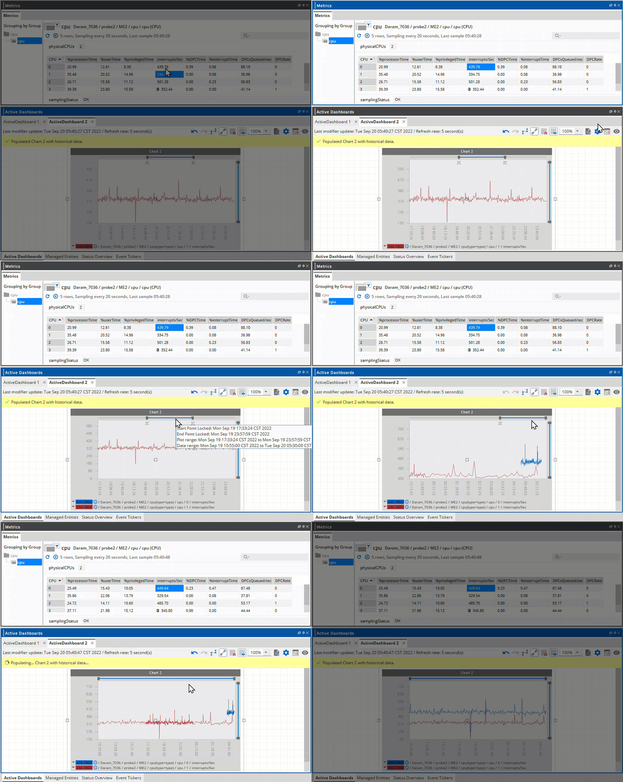
To do this, follow these steps:
- Right-click your desired data item from the Metrics dataview.
- Click History Chart > Chart and then the desired Time Definition.
If you want to repopulate the chart with all the available data points, you need to set the horizontal scrollbar to its original start and end dates. However, this is only applicable to historical datasets. Adding a non-historical ITRS Analytics dataset will not affect the existing historical data points.
Export and import dashboard using ITRS Analytics dataset Copied
Exporting the dashboard saves the data set including the new data points in the selected date range. If this dashboard is imported in another workspace, the chart is loaded with the new data points.
However, if you want to reset the chart with the original data points, you can do this by removing the date range selection from the horizontal scrollbar.
Visualise the time series data on a chart Copied
It is also possible to plot ITRS Analytics time series data in a chart in a similar way that we plot a database time series.
When you right-click on a cell that is the source of time series data that has been queried by Gateway, ITRS Analytics will add an ITRS Analytics Time Series menu item to the context menu. This option will display all the time series queried by Gateway for that specific cell. You can then choose a destination, which can be either a new or existing chart, and then it will be presented with a dialog box.
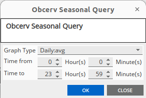
This allows you to set the start time (Time from) and the end time (Time to) of the chart together with the choice of query result (Graph Type).
Note that it is permissible and often correct for the End Time to precede the Start Time. In this case, the graph will run from Start Time to the end of the day, and then to End Time.
The data is then queried and placed in an Active Chart. The chart will re-query its data if any of the following occur:
- Gateway connection drops and reconnects
- Template parameters change
- Time moves from before the start time to after the start time
The workspace saves enough data that if the AC restarts and connects to the Gateway, it will re-query the ITRS Analytics data and reset the chart.
For more information, see ITRS Analytics Time Series for Dynamic Thresholds.
View the Line Chart menu Copied
To view the Line Chart menu:
- Right-click the Line Chart.
- Navigate to Line Chart.
The menu has the following options are:
| Field | Description |
|---|---|
| Save Chart and data to file | Saves the selected chart in a .dbi format. |
| Save Chart as a PNG | Saves the selected chart as an image in a .png format. |
| Export to CSV | Saves all the
chart data in all its datasets to a user-defined
comma separated or .csv file. |
| Launch Table View | Launches a separate window that contains details of the actual data that is plotted on the chart. See View chart in a table view. |
| Interpolate | Forces the chart to run an interpolation. See Interpolate an active chart. |
| Remove Zoom Locks | Disables the zoom functionality in the chart. |
| Comparison Mode | Switches between the chart being in comparison mode or not. |
| Add Chart Data Set |
Adds a new chart dataset to the chart. This is not connected to any data items until you specify them. |
| All Datasets |
Provides access to operations on all datasets on the selected active chart. This provides the following options:
|
| Datasets | Shows all datasets for the chart and allows dataset functions to be invoked on the selected dataset. |
| Repopulate Chart with Historic data | Populates the active chart with previous data. |
View chart in a table view Copied
To launch a tabular view that contains details of the actual data in the chart:
- Right-click the selected chart.
- Click Line Chart.
- Select Launch Table View.
The table view displays the following data from the chart:
- List of data sets from the chart in the DataSets column.
- Threshold events, if applicable.
- Values, such as the X-axis and point values for each data set.
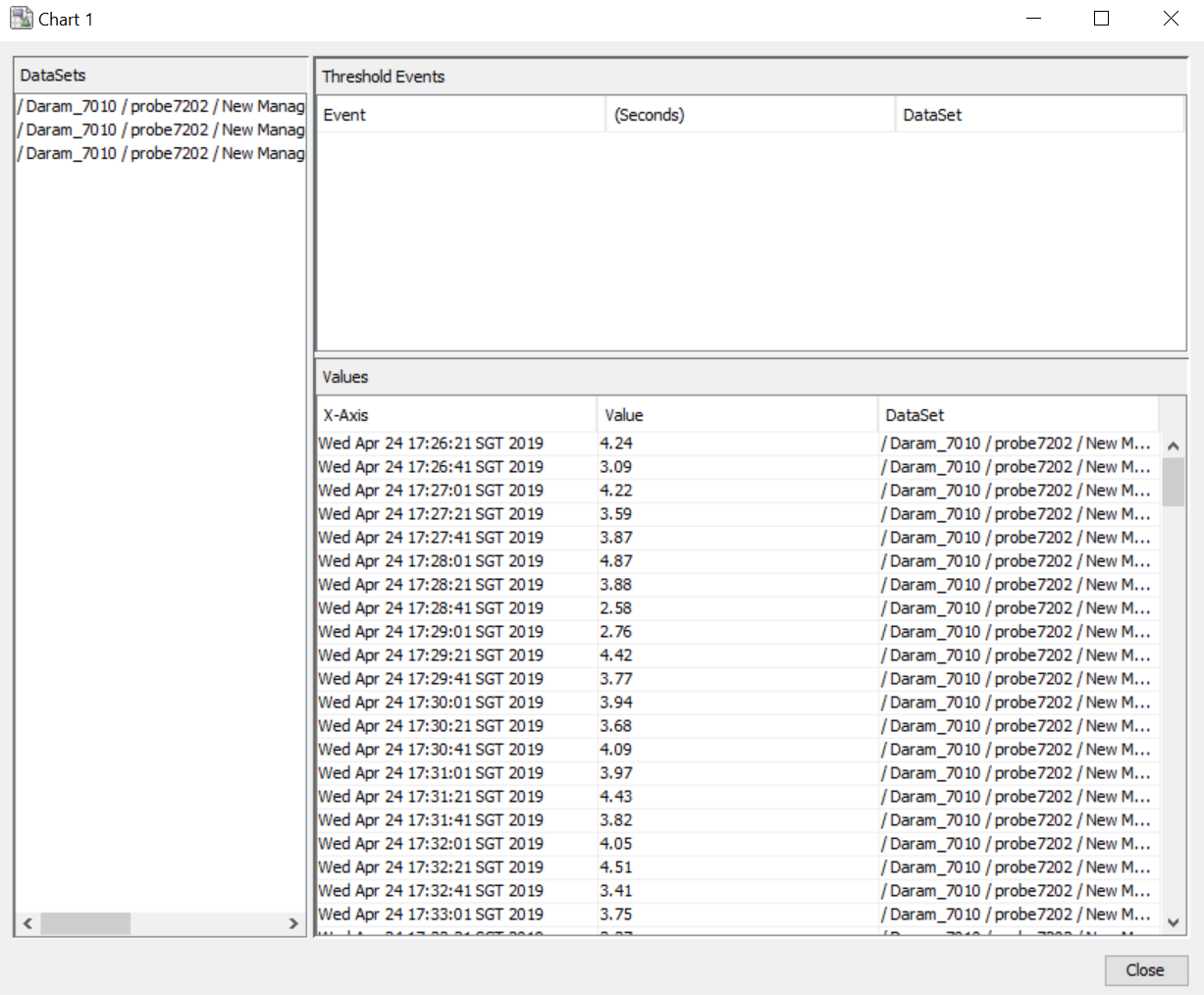
Both these lists can be sorted and their columns reordered. This can be useful for analysing the data for large or unusual values.
Interpolate Line Chart Copied
Line Chart continue to update as long as the Active Console and the connected Netprobe are running. A chart never removes the data from its datasets unless you remove them. Therefore, over time the datasets get bigger, containing days, even weeks, months, or years worth of data.
There are some practical limitations on how many points a chart can display at any given point in time (from both a performance and visibility stand point) and this is the reason for the interpolation function.
To turn on interpolation:
- Right-click the selected chart.
- Click Line Chart.
- Select Interpolate.
How interpolation works Copied
If the number of data points you are asking the chart to plot exceeds a given value (which defaults to 500 per dataset), it interpolates the dataset.
It is reducing the number to its target number for display (which defaults to 250 per dataset), choosing to plot the most significant points from those available. It does this by hiding (not removing) data points that have a similar (or the same) value to the previous point.
Note
You can turn interpolation off any time. In this case, expect the charting routines to become more expensive from a CPU standpoint. If your dataset has over 10,000 data points and you ask it to plot them all, then this could lock the Active Console.
Configure datasets in the chart Copied
Datasets represent each data item that the chart contains. Each chart property of the dataset can be configured in the chart properties.
In this example, there are three datasets that the chart contain:
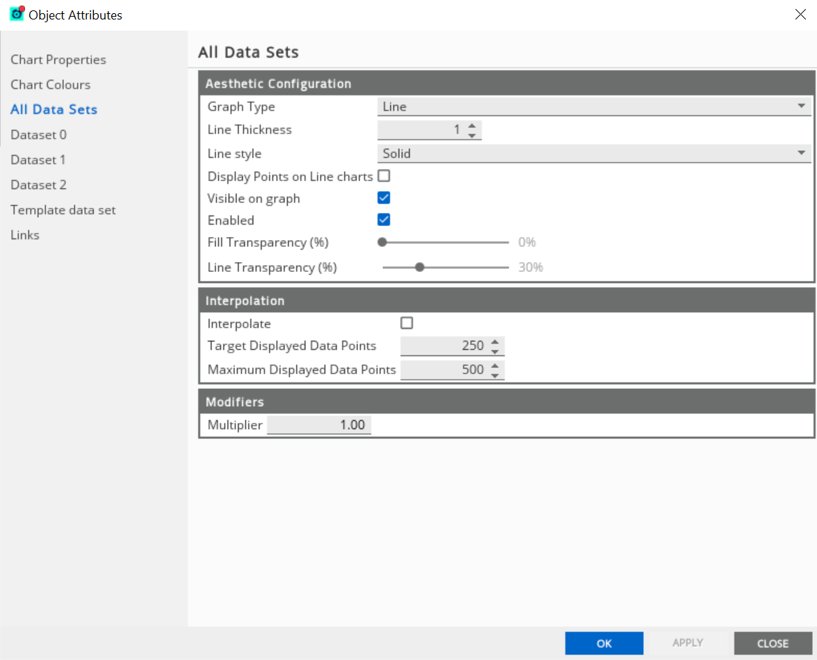
- The Dataset 0, Dataset 1, and Dataset 2 represents the properties of each dataset.
- The All Data Sets tab allows you to configure all datasets simultaneously.
These are the properties that you can configure for each dataset:
| Dataset field | Description |
|---|---|
| Display Name | Name that appears in the legend and tooltips for the dataset. By default, this becomes the user-defined path. |
| Path | Displays the Geneos path to the data item being plotted. Click Edit to modify the path. |
| Plotted Attribute | Attribute from the data item being plotted. In most cases, this contains the default "Value". |
| Graph Type |
Changes the type of graph. Options: Line, Bar, Area, Scatter Plot, Step Graph, Target Marker |
| Line Thickness | Width of the line or border in pixels. |
| Line style |
Style of the line. Option: Solid, Dashed |
| Display Points on Line charts | Defines if the data points (square, triangle, circle) should be plotted in a line chart. |
| Visible on graph | Displays the datasets on the chart. |
| Enabled |
Enables the dataset on the chart. If the dataset is disabled, then the chart is not updated for this data source. You cannot retrieve any data missed while the dataset is disabled. |
| Fill Transparency | Sets the transparency of the fill, where 0% is completely opaque; 100% is completely transparent. |
| Line Transparency | Sets the transparency of the line/border, where 0% is completely opaque; 100% is completely transparent. |
| Data Set Colour | Defines the colour of the dataset when plotted on the chart. |
| Interpolate | See Interpolate active chart. |
| Target Displayed Data Points | Number of data points the dataset should contain after an interpolation. |
| Maximum Display Data Points | If the number of data points exceeds this value, then the dataset interpolates. |
| Multiplier |
A value by which all the data point values are multiplied to. For example, a value of "2" doubles the plotted data point values. |
Convert a dataset into a target marker Copied
The Target Marker allows you to visualise threshold markers and values in the Line Chart.
The conversion of the selected dataset into a horizontal line or marker in the Line Chart is based on its cell value from the metrics dataview.
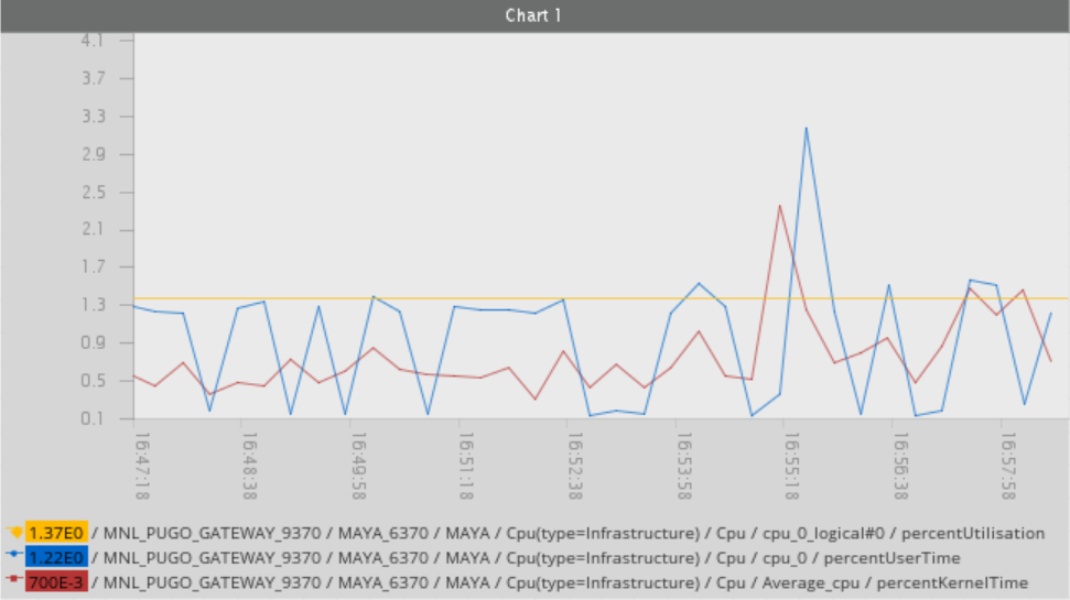
This example, the Line Chart has three cell values used from the metrics dataview:
percentKernelTimepercentUserTimepercentUtilisation
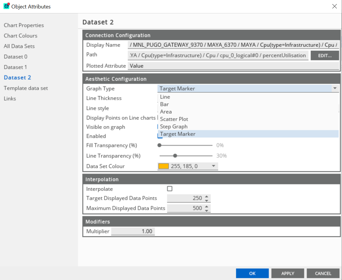
Each dataset has its own colour legend that you can also modify in the Object Attributes properties. In the example, the dataset for percentUtilisation has been converted into a target marker.
To convert a dataset into a target marker:
- Go to Active Console > View > Active Dashboards.
- Drag and drop the metrics dataview values on the Active Dashboard tab.
- Select Line Chart in the Tools & Modifiers screen.
- Click OK.
- Select the dataset you want to convert in the Line Chart.
- Right-click the Line Chart, and click Properties.
- Go to the Dataset tab of the selected data item.
- Click the Graph Type menu in the Aesthetic Configuration group.
- Select the Target Marker option.
- Click OK to save the changes.
Note
There is no limit to the number of datasets you can convert into target markers. One dataset conversion becomes one target marker in Line Chart.
Use template data set Copied
The values that you configure in the Template data set are used as defaults when new datasets are subsequently created. To configure this property:
- Go to the chart object properties.
- Click Template data set.
- Set the new configurations.
- Click OK.
Use chart comparison mode Copied
Line Chart has a special mode which allows datasets from different time periods to be directly overlaid on the same chart.
To enable chart comparison mode:
- Right-click the selected chart
- Click Line Chart > Comparison Mode.
- Alternatively, enable the Comparison Mode in the Chart Properties.
For example, the data from
yesterday between 2:00-4:00PM can be plotted over the top
of data from 2:00-4:00PM today. This is called the Comparison Mode ![]() .
.
If you use this, the start date of all datasets revert to the:
- User-defined start date.
- Start date of the oldest dataset, if not defined.
The dataset where the Comparison Mode ![]() is enabled gets an indicator in the legend to
indicate that their time data has been modified:
is enabled gets an indicator in the legend to
indicate that their time data has been modified:

Pan and zoom the chart data Copied
You can pan and zoom around the data that an a Line Chart contains. To do this, you can either:
- Right-click the Line Chart and click Zoom.
- Modify the values of the Line Chart properties dialog.
- Tick the Show Scrollbar in the X-Axis and Y-Axis Settings.
Note
The start date, end date, lower, and upper Y scale values are automatically configured by Line Chart over time to best display the data contained in the chart’s datasets.
Once you start panning and zooming, you essentially override these automatic mechanisms with your own hard coded values. The Line Chart has two scroll bars, a horizontal one (X axis), which allows you to pan and zoom over time, and a vertical scroll bar (Y axis) which allows you to zoom in on specific value ranges:
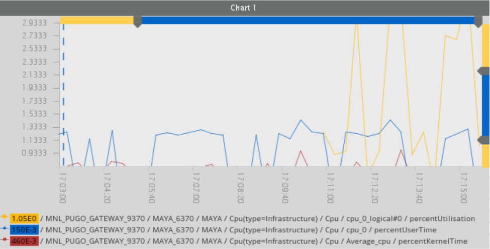
The start and end pointer change the start and end of the plot range respectively, be it the X axis (time) or the Y values. An orange pointer means you have fixed the relevant start or end point on the X or Y axis.
The locks are also removed if the start or end pointers are moved to their default position (which is generally at the beginning or end of the scroll bar, apart from the start time pointer which can vary). You can pan the available data by scrolling with the scroll bar itself directly (rather than the start and end points).
You can hide the scroll bars in the chart properties.
Create history charts Copied
You can create charts of data that you have previously logged to a data source. To log a data item property, such as the value of a managed variable to the data source, you must have configured the relevant Gateway to connect to a data source, when the selected property changes. For more information, see Import historical events from database.
There are a several ways you can create charts from historical data, similar to creating a chart. The only difference is that you select History Chart or the values on the Historical menu from the Tools & Modifiers dialog. See Create an active chart.
The dataset displays the Log to database ![]() indicator to show that a data source
query is running to populate it with data:
indicator to show that a data source
query is running to populate it with data:
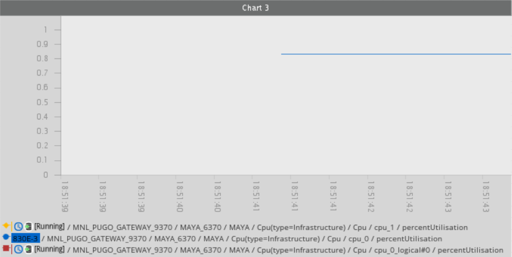
The Active Console dispatches the query to the data source to recover the data. The actual query works asynchronously, meaning the Active Console does not wait for a response and you can carry on working. The query is a command that also appears in the Commands dockable:

When you request data for a predefined time period (hour, day, week, or month), the Active Console connects to the same data source of the Gateway where the data item is configured to use. If the data source query is successful, the database legend annotation is removed.
Note
The option to use the historical chart and historical chart dataset tool is available even the data item is currently being logged to the database. This is because the item may previously have been logged to the database, but is no longer being logged.
Configure Time Definitions Copied
Creating or updating a history chart allows you to populate data based on the available time range defined in the Active Console.
Time Definitions contain default values which you can modify:
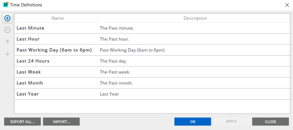
To configure Time Definitions:
-
In Active Console, go to Tools > Time Definitions.
-
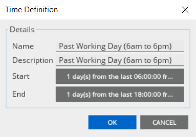
Double-click the row you want to modify to open the time details. In this example, double-click Past Working Day (6am to 6pm).
-
Click Start or End to configure the Time Definition Editor.
-
Click OK to apply the changes.
When history chart is not working Copied
These are common reasons why the history chart might not work properly or cannot populate data correctly:
- Active Console is not connected to the database
- Duplicate cells where the history chart is executed
- Incorrect data type for the database logging item value
- Missing database drivers or client libraries
- The language of the database server and the JVM are different
Active Console is not connected to the database Copied
The Active Console connects directly to the database. Check if the database settings are set up correctly and if the Active Console machine (desktop or laptop) has sufficient network access to the database and database server.
Ensure that the settings where the Active Console gets its database connection details are correctly configured:
- In Gateway Setup Editor, go to Database logging > Database > Client connection. Specific to Oracle database, the Sid, Server name, and Port settings are mandatory.
- In Active Console, go to Workspace settings > Database.
Duplicate cells where the history chart is executed Copied
To resolve the duplicate cells where the history chart is executed:
- Open Active Console > Metrics.
- Right-click the cell where the history chart is executed.
- Hover Copy from
| , and click Legacy Name. | - Paste the Legacy Name on a text file to see the actual variable name. For example,
%update100rowcol.row_0.Column_3. - Run a query in the Geneos database to find any possible duplicate
varnamevalue. - Use
SELECT * FROM var_ref_tableto output all thevarnamevalue. Check if the variable name has a duplicate from the list. - Use
select * from var_ref_table where varname like%update100rowcol.row_0.Column_3to exactly find a match from the Geneos database. - Delete the duplicate variable names. For more information, see Fix variable name duplicates in Gateway Database Logging.
Incorrect data type for the database logging item value Copied
The cell’s value column data type must be set either to REAL or FLOAT.
If the cell’s value column data type is correct, but the history chart still does not work, check the Tables setting:
- In Gateway Setup Editor, go to the Database logging > Tables.
- Check if the Type is set to
Double. - Rerun the history chart.
Missing database drivers or client libraries Copied
For Active Console version 4.11 and below, the Active Console connects to all supported databases using JDBC, with the exception of MySQL which means the Active Console does not need any additional libraries or drivers other than those shipped with the Active Console packaged by default. In the case of MySQL, you need to download the MySQL from their website.
For Active Console version 4.12 and above, the Active Console is now packaged with the MariaDB database connector.
The language of the database server and the JVM are different Copied
The Active Console assumes that the decimal delimiter returns the numbers, where these are comma-separated values. Therefore, the conversion of the returned rows might fail. Check the exception log:
Exception no.6
Fri Apr 12 11:56:55 CEST 2013 java.lang.NumberFormatException: For input string: "26,4E0"
sun.misc.FloatingDecimal.readJavaFormatString(Unknown Source)
To resolve this:
- Open the Active Console installation directory.
- Open the
ActiveConsole.gcifile. - Add
-jvmargsin the file. For example:
-jvmargs
[....]
Duser.language=en
- Save the file.
- Restart the Active Console.
The query from the database should now return a decimal value separated by a dot or decimal point.
Get historical data within specified date range Copied
When populating a historical chart data using User Defined, the User Defined Parameters opens. This returns only the Database Logging connection entries.
To get historical data in the Active Chart for a specific period, go to View > Active Dashboards > Active Dashboard Palette > Line Chart.
- Drag and drop the Line Chart widget in the Active Dashboard canvas.
- Drag and drop the data you want to use from the Metrics view into the Line Chart.
- Click Line Chart in the Tools & Modifiers screen, and then click OK.
- Right-click the populated chart and select Re-populate all charts with Historic data.
- Click User Defined.
- Click Yes in the Re-populate chart dialog. This opens the User Defined Parameters dialog.
- Fill out the fields to specify the time period, and click OK.
The User Define Parameters has the following options:
| Field | Description |
|---|---|
| Time from | Start date and time for the data you want to recover. Date format: Month, date, year Time format: Hour, minute, seconds |
| Time to | End date and time for the data you want to recover. Date format: Month, date, year Time format: Hour, minute, seconds |
| Max results (-1 means no limit) | Maximum number of data points that must be recovered to get all the matching data. If more than the maximum number of data points are defined, then the older data points take precedence over the newer data points. Default: -1 |
Recover data for a disconnected data item Copied
You may want to plot historical data for a data item that is either no longer configured in a Gateway, or a Gateway you are no longer connected to You can do this by following these steps:
- Configure the data source connection. If the Gateway is not connected and none of the existing Gateways use the same data source connection, you need to manually define the database settings in the Workspace Settings. You can skip this step if the required data source connection is already known to Active Console. The data source value can be either set to Database Logging or Gateway Hub.
- Create a new dataset. If required, you can use the chart tool in the dashboard tools to create a new one.
- Setup the path in the dataset. Right-click the chart and select Properties to modify the path. See Geneos URL editor. You need to define the path of the item you want the data for.
- Recover the data. Right-click the new dataset in the legend of the chart and select the Supplement with Historical data > User defined. In the resultant dialog, select the relevant database connection, and the time period that you want the data for. If you have correctly defined all the parameters, such as the path, database, time from and to, then the chart retrieves the data.
Note
If no data is available for the selected data item in the database, then this prompts the Active Chart Error message.
Import saved charts Copied
Charts that are saved in a DBI format can be loaded into another Active Console at any time. The DBI file saves the aesthetic and data properties of the chart.
If an imported chart is loaded with datasets that are enabled and refer to directory components that are active in the Active Console, then these resume ticking from the point the charts are imported.
Area Chart Copied
You can modify the style and properties of an Area Chart by clicking Show Object Inspector ![]() .
.
When you drag the Area Chart to the Active Dashboard, the Dataset > Graph Type automatically sets to Area.
To create an Area Chart:
- Select the data item from the Metrics dataview.
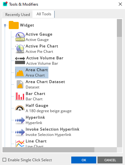
- Drag the selected data item into the Active Dashboard. This opens the Tools & Modifiers dialog.
- Select Area Chart in the Tools & Modifiers dialog.
- Click OK.
Alternatively, you can create an Area Chart with multiple data items:
- Press
CTRLwhile selecting multiple data items from the Metrics dataview. - While pressing the
CTRLand the selected data items, drag these data items into the Active Dashboard. This opens the Tools & Modifiers dialog. - Select Area Chart in the Tools & Modifiers dialog.
- Click OK.
Add data to existing Area Chart Copied
To add datasets into an existing Area Chart:
- Press
CTRLwhile selecting one or multiple data items from the Metrics dataview. - While pressing the
CTRLand the selected data items, drag these data items into an existing Area Chart. This opens the Tools & Modifiers dialog. - Select Area Chart Dataset in the Tools & Modifiers dialog.
- Click OK.
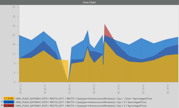
Here is an example of an Area Chart with multiple data items:
Scatter Plot Copied
You can modify the style and properties of a Scatter Plot graph by clicking Show Object Inspector ![]() .
.
When you drag the Scatter Plot to the Active Dashboard, the Dataset > Graph Type automatically sets to Scatter Plot.
To create a Scatter Plot:
- Select the data item from the Metrics dataview.
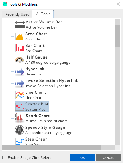
- Drag the selected data item into the Active Dashboard. This opens the Tools & Modifiers dialog.
- Select Scatter Plot in the Tools & Modifiers dialog.
- Click OK.
Alternatively, you can create a Scatter Plot with multiple data items:
- Press
CTRLwhile selecting multiple data items from the Metrics dataview. - While pressing the
CTRLand the selected data items, drag these data items into the Active Dashboard. This opens the Tools & Modifiers dialog. - Select Scatter Plot in the Tools & Modifiers dialog.
- Click OK.
Add data to existing Scatter Plot Copied
To add datasets into an existing Scatter Plot:
- Press
CTRLwhile selecting one or multiple data items from the Metrics dataview. - While pressing the
CTRLand the selected data items, drag these data items into the existing Scatter Plot. This opens the Tools & Modifiers dialog. - Select Scatter Plot Dataset in the Tools & Modifiers dialog.
- Click OK.
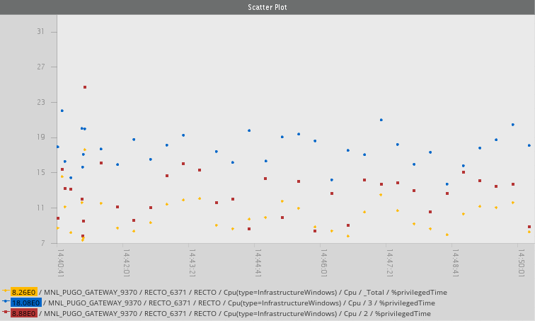
Here is an example of an Scatter Plot with multiple data items:
Step Graph Copied
You can modify the style and properties of a Step Graph by clicking Show Object Inspector ![]() .
.
When you drag the Step Graph to the Active Dashboard, the Dataset > Graph Type automatically sets to Step Graph.
To create a Step Graph:
- Select the data item from the Metrics dataview.
- Drag the selected data item into the Active Dashboard. This opens the Tools & Modifiers dialog.
- Select Step Graph in the Tools & Modifiers dialog.
- Click OK.
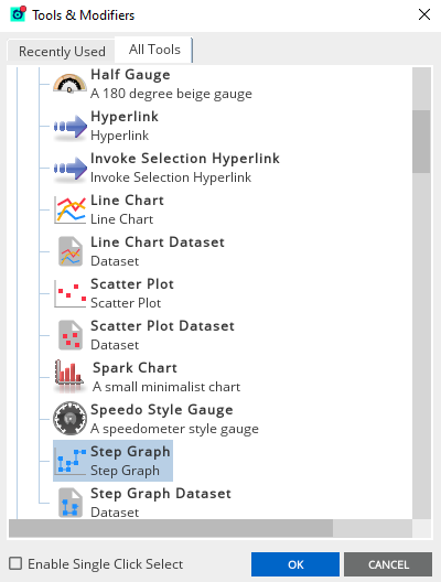
Alternatively, you can create a Step Graph with multiple data items:
- Press
CTRLwhile selecting multiple data items from the Metrics dataview. - While pressing the
CTRLand the selected data items, drag these data items into the Active Dashboard. This opens the Tools & Modifiers dialog. - Select Step Graph in the Tools & Modifiers dialog.
- Click OK.
Add data to existing Step Graph Copied
To add datasets into an existing Step Graph:
- Press
CTRLwhile selecting one or multiple data items from the Metrics dataview. - While pressing the
CTRLand the selected data items, drag these data items into the existing Step Graph. This opens the Tools & Modifiers dialog. - Select Step Graph Dataset in the Tools & Modifiers dialog.
- Click OK.
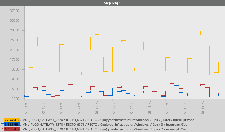
Here is an example of an Step Graph with multiple data items:
Spark Chart Copied
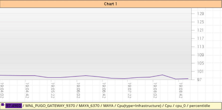
The Spark chart is a small and minimalist chart that is available in the Active Dashboard Palette. Creating a spark chart is the same as creating a Line Chart. See Create an active chart.
The properties for a Spark chart are the same as those for a standard Active chart. You can also add datasets to a Spark chart by using the Spark Chart Dataset and Historical Chart Dataset tools.
By default, the Spark Chart does not display the legend, heading, and other labels. To modify the chart’s properties, see Configure chart properties:
Active Gauge Copied
A dashboard is capable of displaying multiple Active Gauges that can display multiple datasets from different data items.
The value of a dataset is displayed through a pointer. The pointer is constrained by a minimum and a maximum boundary which must be either manually assigned or left to be automatically determined over time by the Active Gauge itself. The number of pointers depend on the number of datasets:
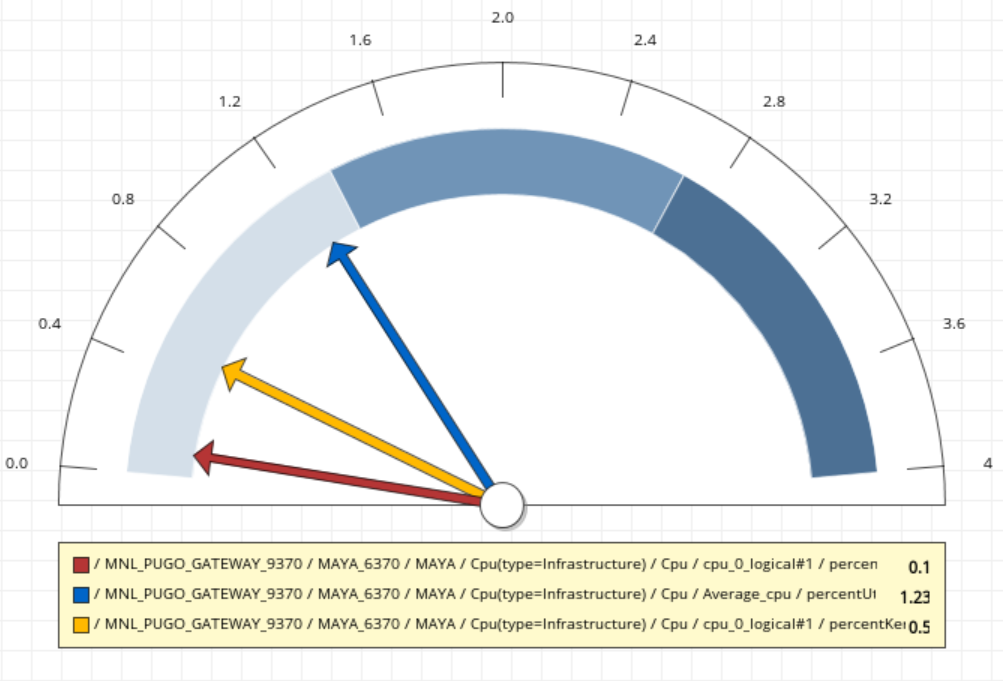
Active Gauges update automatically over time as the attributes of the data items are changing. An update occurs each time the value changes.
Create an active gauge Copied
To create a new Active Gauge:
- Select the data item from the Metrics dataview.
- Drag and drop the selected data item into the Active Dashboard. This opens the Tools & Modifiers dialog.
- Select Active Gauge in the Tools & Modifiers dialog.
- Click OK.
If you want to create a new Active Gauge with multiple data items:
- Press
CTRLwhile selecting multiple data items from the Metrics dataview. - While pressing the
CTRLand the selected data items, drag and drop these data items into the Active Dashboard canvas. This opens the Tools & Modifiers dialog. - Select Active Gauge in the Tools & Modifiers dialog.
- Click OK.
Add data to existing active gauge Copied
To add datasets into an existing Active Gauge, follow these steps:
- Press
CTRLwhile selecting one or multiple data items from the Metrics dataview. - While pressing the
CTRLand the selected data items, drag and drop these data items into the Active Dashboard canvas. This prompts the Tools & Modifiers dialog. - Select Gauge Dataset in the Tools & Modifiers dialog.
- Click OK.
Configure active gauges properties Copied
To configure the properties of an Active Gauge, you can:
- Right-click the selected chart and click Properties.
- Click the shape and press
CTRL+Enter. - Modify the properties using the Object Inspector
The table below shows the properties of an Active Gauge:
| Settings | Description |
|---|---|
| General Settings |
Defines the aesthetic and style of the text present in the widget. This includes the:
|
| Scale Settings | Modifies the external shape properties and enable labels. |
| Shape Settings |
Changes the orientation of the widget that includes:
|
| Boundary Settings |
This can be configured by setting it to:
|
| Segment Settings |
A segment is defined by a Start From and an End At property. These settings can be modified by entering an explicit value or by percent. If auto-resize is enabled in the boundary settings, then segments can only be defined by percent. |
Configure segments in active gauge Copied
Defining a segment by value requires a Start From and an End At value which coincides within the gauges minimum and maximum boundary.
For example, if the minimum boundary of the active gauge is 0 and the maximum boundary of the active gauge is 500, the Start From and End At values must be in between these boundaries “0-200”, “300-400”, “0-500”. The Start From value must also be less than the End At value.
Segments do not have to be continuous. If two segments are defined, the second segment does not have to start from where the first finished at.
If a segment is defined by percent, the minimum and maximum values must coincide between 0 and 100%.
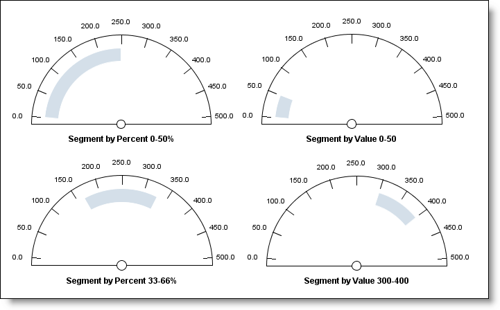
Another important setting for segments is the Start Fill and End Fill property. These properties define the thickness of the segment and are set as a percentage. The Start Fill is the start percentage from the base of the active gauge, while the End Fill is the end percentage from the base of the active gauge.

Active Pie Charts Copied
Active Pie Charts are available in the Active Dashboard Palette. A dashboard is capable of displaying multiple Active Pie Charts that can display multiple datasets from different data items. The value of a dataset is represented by a slice in the Active Pie Chart:
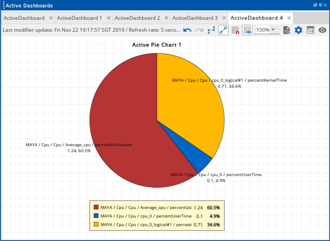
Active Pie Charts update automatically over time as the attributes of the data items are changing. An update occurs each time the value changes.
Create active pie charts Copied
To create an Active Pie Chart:
- Select the data item from the Metrics dataview.
- Drag and drop the selected data item into the Active Dashboard. This open the Tools & Modifiers dialog.
- Select Active Pie Chart in the Tools & Modifiers dialog.
- Click OK.
To create an Active Pie Chart with multiple data items:
- Press
CTRLwhile selecting multiple data items from the Metrics dataview. - While pressing the
CTRLand the selected data items, drag and drop these data items into the Active Dashboard canvas. This opens the Tools & Modifiers dialog. - Select Active Pie Chart in the Tools & Modifiers dialog.
- Click OK.
Add data to existing active pie chart Copied
To add datasets into an existing Active Pie Chart, follow these steps:
- Press
CTRLwhile selecting one or multiple data items from the Metrics dataview. - While pressing the
CTRLand the selected data items, drag and drop these data items into the existing pie chart. This opensthe Tools & Modifiers dialog. - Select Active Pie Chart Dataset in the Tools & Modifiers dialog.
- Click OK.
Configure active pie charts Copied
To configure the properties of an Active Pie Chart, you can:
- Right-click the selected chart and click Properties.
- Click the shape and press
CTRL+Enter. - Modify the properties using the Object Inspector
The table below shows the properties of an Active Pie Chart
| Field | Description |
|---|---|
| Title |
Name of the pie chart. Default: Enabled Options:
|
| Labels | Path of the data item you selected from the metrics dataview. This displays in the centre of the pie chart. Default: Enabled Example: GW / GW ME / Server name / severity / actual value |
| Legend | Path of the data item you selected from the metrics dataview. This displays a panel below the pie chart. Default: Enabled Example: GW / GW ME / Server name / severity / actual value |
| Visual Quality | Determines the pie chart's image resolution. Options: High, Low |
| Orientation (degrees) | Sets the starting angle position of the pie chart in a clockwise manner. This can accommodate values between 0-360 degrees. When a value is a negative number, it sets the pie chart orientation in a counter-clockwise manner. Default: 0 |
Bar chart Copied
A dashboard is capable of creating a bar chart that can display a data set using the selected data item.
To create an Bar Chart:
- Select the data item from the Metrics dataview.
- Drag and drop the selected data item into the Active Dashboard. This opens the Tools & Modifiers dialog.
- Select Bar Chart in the Tools & Modifiers dialog.
- Click OK.
To create a Bar Chart with multiple data items:
- Press
CTRLwhile selecting multiple data items from the Metrics dataview. - While pressing the
CTRLand the selected data items, drag and drop these data items into the existing bar chart. This opens the Tools & Modifiers dialog. - Select Bar Chart in the Tools & Modifiers dialog.
- Click OK.
Add data to existing bar chart Copied
To add datasets into an existing Bar Chart:
- Press
CTRLwhile selecting one or multiple data items from the Metrics dataview. - While pressing the
CTRLand the selected data items, drag and drop these data items into the existing bar chart. This opens the Tools & Modifiers dialog. - Select Bar Chart Dataset in the Tools & Modifiers dialog.
- Click OK.
Note
When you drag and drop data items into the Active Dashboard for the first time, the Bar Chart and Bar Chart Dataset are located on the All Tools tab in the Widget section. In an existing workspace where bar charts are used, these options are accessible on the Recently Used tab.
In this bar chart, multiple datasets are used from the plug-in’s metrics dataview:
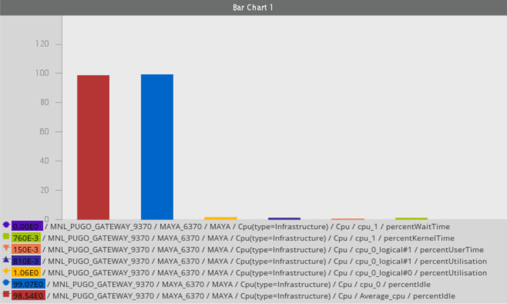
Each dataset has its own colour legend that you can also modify in the Chart Properties.
Configure picture format Copied
To upload an image in the Active Dashboard canvas:
- Go to Active Dashboard Palette > Widget > Picture.
- Drag and drop the Picture tool into the dashboard canvas. This opens the Open dialog.
- Select the image from your local machine.
- Click Open. The image displays in the Active Dashboard canvas.
- Right-click the image and click Properties.
- Click Picture Format.
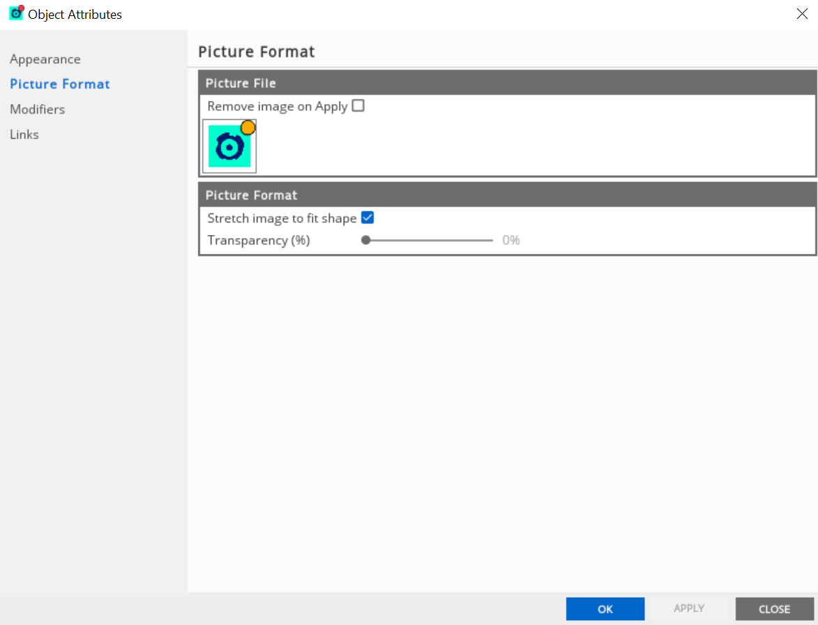
The Picture Format tab has the following options:
- Picture — a thumbnail preview of the image. To change this, double-click the image icon.
- Remove image on Apply — if you do not want the picture to contain an image, then select this option.
- Stretch image to fit shape — if disabled, the image stops from scaling. Then, it displays it at its normal size.
- Transparency — adjusts the transparency of the image.
Note
When pictures are imported into the workspace, the original source images are not required even if you are exporting/importing the dashboard into another workspace.