Box plot charts
The box plot option allows you to view detailed information about three metrics: memory, CPU, and Disk I/O usage of both the host and its VMs. You can use the box plot option to identify trends in utilisation of VMs and hosts. When you drill-through, you are presented with box plot charts and time series. Box plot charts are also used extensively in advanced reporting across all metrics.
Basic structure of the box plot charts is as follows:
- Box plots display data by quartiles, showing upper and lower extremes and mid-range values. A median value is also shown using a line within the bounds of the box.
- Outliers are not included in Capacity Planner box plot charts. Outliers are values that are numerically distant from the rest of the observed data.
By default, metric performance data is gathered every 5 minutes for the last 3 months. This makes it possible for the day charts to be accurate to 5 minutes.
Available charts Copied
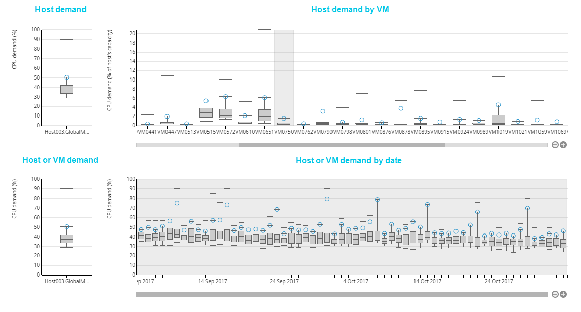
Four charts in total are available when you open box plots from the context menu of the sunburst or from the headroom dialog window. All four are displayed when you are looking at the box plots for a host.
The charts are arranged in pairs, the chart on the left being a summary of the data presented in the chart on the right. In other words, the detailed calculations that you see in the charts on the right show how the behaviours represented here affect the item displayed in the chart on the left. For example, Host Memory demand by VM for Host chart shows data that affects the overall Host Memory demand.
Available charts are as follows:
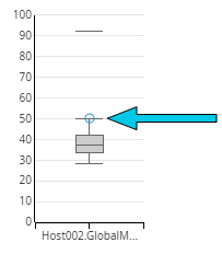
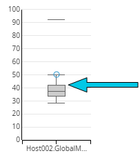
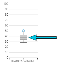
- Host demand — shows a box plot of the host demand, expressed as a percentage of its overall capacity. The host headroom is based on the 95th percentile value in this chart. The axis always runs from 0 to 100 %. This chart is only available for hosts.
- Host demand by VM — shows a box plot of each VM’s demand, expressed as a percentage of the host’s overall capacity. This allows comparison of the relative usage of resource on the resource on host by each VM. The axis is scaled according to the highest upper whisker across all VMs. This chart is only available for hosts.
- Host or VM demand — shows underlying data and attributes for the host or a selected VM. This area initially shows data for the host, but will update to show data for a VM if one is selected on the VM demand chart. This chart is available for both hosts and VMs.
- Host or VM Demand by date — shows a box plot of demand for each day for the host or a selected VM. This chart initially shows the host demand, but will update to show a VM demand if a VM is selected on the host demand by VM chart. The demand is shown as a percentage of the host’s overall capacity. The axis is scaled to according to the highest upper whisker across all days. This chart is available for both hosts and VMs.
Note
The names of the charts change depending on which metric you are viewing: CPU, memory or Disk I/O.
Box plot breakdown Copied
Quartiles Copied
Capacity Planner quartiles are bound by specific percentiles:
- The box is where the usage percentage spends most of its time.
- The quartiles are bound by individual percentile values.
Note
Capacity Planner box plots do not display outliers.
Percentiles Copied
The 100% peaks and 0% troughs are not necessarily a good indication of overall performance of the hosts. Rather than use an average, Capacity Planner uses percentile measures.
By default, the CPU measure is 95th percentile but this can be changed in the Model panel. This reflects that the value of the metric was at this level or lower 95 percent of the time that is summarised. While a sensitive measure, this is not as sensitive as the peak. Using peak can significantly overstate capacity requirements and lead to inefficient use of the resource available.
To better understand how percentiles are reflected in the box plots, see these details:
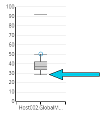
- The upper whisker of the box plot shows the 95th percentile. This means that 95% of the time, the value is at or below this level. This is also the default measure used for CPU headroom calculations and visualisation.
- The top of the box represents the 75th percentile. This means that 75% of the time, the value is at or below this level.
- The line in the middle of the box is the 50th percentile, representing the median value — the exact middle value of all observed values.
- The bottom of the box represents the 25th percentile, meaning that it spends 25% of its time is at or below that value.
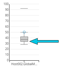
- The lower whisker shows the 5th percentile, meaning that the value spends 5% of its time below that level. This is also the minimum value the box plots show.
Note
Each of the percentile values is always drawn on the chart. However, two or more of the values can often be exactly the same or very near to each other. This makes it look like the one of percentiles hasn’t been drawn on the chart, when in fact it has. This often happens with the 5th & 25th percentiles and the 95th & 75th percentiles.
Peak Copied
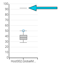
The peak is the 100th percentile value of usage. The peak value is used to calculate information on your Baseline View, and therefore determines how your Baseline View is coloured.
The peak is shown as a short horizontal line above the box plot.
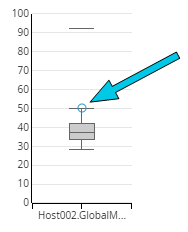
Value used Copied
A blue circle on the box plot indicates the value used in the calculations to generate your Baseline View, as summary for headroom calculations for each Host and VM. It directly affects the colouring of each segment and VM in your Baseline View.
The values are defined separately for each resource, both memory and CPU:
- The memory value displays the 100th percentile.
- The CPU Value displays the 95th percentile.
The value used can be changed by selecting alternative measures in the Model panel. For more information, see Statistical summaries in the Baseline View.
Open box plot charts Copied
Box plot charts can be accessed from Baseline View and Forward Thinking scenario models.
To view box plot charts from a Baseline View, follow these steps:
- Open the Baseline View you want to see the details for.
- Right-click a host or VM.
- Click Drill-through.
The box plots are displayed, showing the CPU utilisation by default. To see box plots for other metrics, open the corresponding tab.
To view box plot charts from a Forward Thinking scenario model, follow these steps:
- Open the Forward Thinking scenario model you want to see the details for.
- Right-click a host or VM.
- Click Headroom. A baseline summary dialog opens.
- In the dialog window, click Options
 next to the required metric.
 - Click Boxplots.
The box plots are displayed, showing the metric that you selected by default. To see box plots for other metrics, open the corresponding tab.
Using box plots Copied
When you want to see more calculations for the selected host, you need to drill through the box plots to show more data. This works the same for all available metrics: CPU, memory and disk I/O.
Change metric Copied
To view different metrics in the box plot charts, click the tab in the top right of the window for the desired metric. Available metrics are:
- CPU — demand for CPU, expressed in percentiles.
- Memory— demand for memory, expressed in percentiles.
- Disk I/O — demand for disk I/O, expressed in KBps.
View the host’s box plots and time series Copied
To view box plots for the host, click the box plot in the host demand chart in the top left corner. The charts present the following data:
- Host demand by VM — displays all the VMs that the host serves.
- Hover over a box plot for a specific VM to see the details of this VM’s demand, expressed as a percentage of the host’s overall capacity.
- Host demand by date — displays the details of the host demand on a specific date.
- To see the details of this host demand on a specific day, hover over a box plot for this date.
- To see host demand distributed across the hours, click a specific date. The time series chart then displays the demand spread across the hours in that day. Note that you can’t drill through to this chart if there is no time series data available in your model.
- To go back to the date view, click the date box plot to the left on the chart.
View the VM’s box plots and time series Copied
To view box plots for a specific VM, click that VM in the Host demand by VM chart in the top right corner. All days covered by the current baseline model and summary are highlighted in the box plot charts. Time series data is not available when clicking through a summary that is not part of the current baseline model. The VM demand by date chart at the bottom updates to present the following data:
- VM demand for the metric you are currently viewing — this box plot displays demand of that VM relative to its current configured capacity. It is not possible for values on this chart to exceed 100%. This would be the case if capacity was reduced from historically higher values and those historical usage values were higher than current configured capacity.
- VM demand by date — this chart displays the details of the VM demand on a specific date.
- To see the details of this VM demand on a specific day, hover over a box plot for this date.
- To see VM demand distributed across the hours, click a specific date. The time series chart then displays the demand spread across the hours in that day. Note that you can’t drill through to this chart if there is no time series data available in your model.
- To go back to the date view, click the date box plot to the left on the chart.
View the percentile values Copied
Each box plot contains its percentile values. To see them, hover over the box plot to see the values.