Sunburst colours
Overview Copied
The colours in your sunburst or timeburst give you an indication of how close to capacity individual segments in the sunburst are depending on what metric view you are looking at (for example, VM headroom or CPU usage). This is based on the aggregate modelled demand from the workloads hosted under that segment.
There are four colour schemes available for your Baseline View. They each apply a different gradient to the Baseline View data to show you either a high granular range of values, or a high contrast basic three-colour range. The legend of the sunburst displays an indicator that shows how close to capacity the server in question is.
The colour schemes are:
Gradient colour scheme is used by default when you first open the Baseline View.
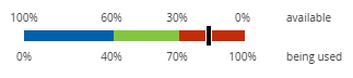
Chromatic colour scheme Copied
Chromatic colours let you see very quickly which areas of your IT infrastructure need your attention the most. Three colours are used to indicate low, medium, and high consumption or provisioning.
When using this scheme, you can zoom into a segment and then switch to gradient colour to see with more detail how your estate is being used.
When you hover your mouse over any segment in the sunburst, a black indicator appears in the sunburst legend that gives you a more exact percentage of available and used capacity.
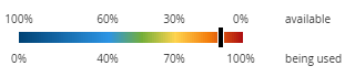
Gradient colour scheme Copied
The gradient colour scheme colours your chart using the whole colour spectrum. This colour scheme shows the most detailed view of how your IT infrastructure is being used.
If you compare it to a chromatic colour scheme, it may transpire that servers that appear over or under provisioned are actually within your own tolerances when using the gradient colour scheme.
This is the default colour scheme used in Baseline View to provide you with as much accurate detail as possible while you create your views and scenarios.
When you hover your mouse over any segment in the sunburst, a black indicator appears in the sunburst legend that gives you a more exact percentage of available and used capacity.
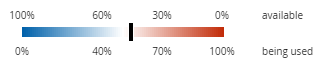
Divergent colour scheme Copied
The divergent colour scheme uses red and blue the same way as the gradient colour scheme, but diverging from a white central colour. The shades of red and blue become darker as the value moves closer to saturation or zero demand respectively.
When you hover your mouse over any segment in the sunburst, a black indicator appears in the sunburst legend that gives you a more exact percentage of available and used capacity.
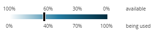
Tonal colour scheme Copied
The tonal colour scheme uses different shades of one colour to show the differences between areas of your IT infrastructure. One colour is used to ensure no bias is given to a particular value, in the way that red is traditionally ‘bad’ and green is traditionally ‘good’. Because a single colour is used, this colour scheme is suitable for users with colour blindness.
When using this scheme, you can zoom into a segment and then switch to gradient colour to see with more detail how your estate is being used.
When you hover your mouse over any segment in the sunburst, a black indicator appears in the sunburst legend that gives you a more exact percentage of available and used capacity.
Other colours Copied
In addition to the chosen colour scheme, other colours may be displayed in the sunburst to indicate the status of a Segment.
Note
Pay attention to both the colour scheme being used and the purpose of each of the hosts that is displayed before making a judgement on how well a particular host is performing.
Grey Copied
If a segment is displayed in grey, no data has been uploaded to the project for that host.
Black Copied
If a segment is displayed in black, the host is overcommitted. This means that the aggregate demand from the hosted workloads is beyond the configured capacity limits of the server.
Red Copied
Red does not always mean something bad is happening. You might have one or more servers that you want to be running as much and as often as possible. These servers are displayed in red because they are nearing their available resource limits, not because Capacity Plannermeasured their performance as bad. That is a decision you must make based on your own understanding of your IT infrastructure.
White Copied
White is used in two different ways in the sunburst:
- As a part of the existing colour schemes (for example, tonal and divergent). In this case check the sunburst legend to understand what the white colour indicates.
- To indicate that server capacity cannot be calculated for the selected metrics. For example, if you’re looking at the VM headroom metric and you have a physical server appearing in your sunburst, then that server’s segment will appear as white because the concept of VM headroom does not apply in the purely physical environment. If you hover the mouse over such segment, there will be no indicator appearing in the sunburst legend.
Change the colour scheme Copied
Change the colour scheme in your Baseline View to see the server and workload capacity for different metrics.
To change the Baseline View colour scheme:
- From the application menu bar, select View > Sunburst color.
- Select a new colour scheme from the available list.
The Baseline View is automatically updated with the new colour scheme.
You can repeat this action and change the colour scheme depending on your current needs for every segment you zoom into.